
General overview of using dianna
DIANNAis a Python package that brings explainable AI (XAI) to your research project.
It wraps carefully selected XAI methods (explainers) in a simple, uniform interface. It’s built by, with and for (academic) researchers and research software engineers working on machine learning projects.
This overview illustrates the main strengths of DIANNA, namely supporting many data modalities and several explainers. DIANNA is future-proof by supporting and advocating the ONNXde-facto standard for Neural Network models. Many modern frameworks alpready support native export to ONNX, for tutorials on conversion from PyTorch, Keras, Scikit-learn and TensorFlow see conversion_onnx folder.
General workflow
Provide your trained model and data item ( text, image, time series or tabular )
model_path = 'your_model.onnx'  # model trained on your data modality
data_item = <data_item> # data item for which the model's prediction needs to be explained
If the task is classification: which are the classes your model has been trained for?
labels = [class_a, class_b] # example of binary classification labels
Which of these classes do you want an explanation for?
explained_class_index = labels.index(<explained_class>) # explained_class can be any of the labels
Run dianna with the explainer of your choice ( ‘LIME’, ‘RISE’ or ‘KernalSHAP’) and visualize the output:
explanation = dianna.<explanation_function>(model_path, data_item, explainer)
dianna.visualization.<visualization_function>(explanation[explained_class_index], data_item)
Setting up
Colab Setup
[1]:
running_in_colab = 'google.colab' in str(get_ipython())
if running_in_colab:
  # install dianna
  !python3 -m pip install dianna[notebooks]
Libraries
[2]:
import os
import warnings
warnings.filterwarnings('ignore') # disable warnings relateds to versions of tf

import numpy as np
import pandas as pd

# for explanations and visualization
import dianna
from dianna import visualization
from dianna import utils as dianna_utils
from dianna.utils.tokenizers import SpacyTokenizer
from dianna.utils.onnx_runner import SimpleModelRunner
from dianna.utils.downloader import download

# ONNX
import onnx
import onnxruntime
from onnx_tf.backend import prepare
from dianna.utils.onnx_runner import SimpleModelRunner

# text-related
import spacy
from scipy.special import softmax
from scipy.special import expit as sigmoid

# keras model and preprocessing tools for Image
from tensorflow.keras.applications.resnet50 import ResNet50, preprocess_input, decode_predictions
from keras import backend as K
from keras import utils as keras_utils

# for tabular data
from sklearn.model_selection import train_test_split
from numba.core.errors import NumbaDeprecationWarning
import warnings
# silence the Numba deprecation warnings in shap
warnings.simplefilter('ignore', category=NumbaDeprecationWarning)

# visualizations
import matplotlib.pyplot as plt
%matplotlib inline

import random
random.seed(42)
WARNING:tensorflow:From C:\Users\ChristiaanMeijer\anaconda3\envs\dianna3113\Lib\site-packages\keras\src\losses.py:2976: The name tf.losses.sparse_softmax_cross_entropy is deprecated. Please use tf.compat.v1.losses.sparse_softmax_cross_entropy instead.

WARNING:tensorflow:From C:\Users\ChristiaanMeijer\anaconda3\envs\dianna3113\Lib\site-packages\tensorflow_probability\python\internal\backend\numpy\_utils.py:48: The name tf.logging.TaskLevelStatusMessage is deprecated. Please use tf.compat.v1.logging.TaskLevelStatusMessage instead.

WARNING:tensorflow:From C:\Users\ChristiaanMeijer\anaconda3\envs\dianna3113\Lib\site-packages\tensorflow_probability\python\internal\backend\numpy\_utils.py:48: The name tf.control_flow_v2_enabled is deprecated. Please use tf.compat.v1.control_flow_v2_enabled instead.
Data modalities
DIANNA supports text, images, time-series and tabular data.
Text example*
Let’s illustrate the general workflow above with textual data. The data item of interest is a sentence being (a part of) a movie review and the model has been trained to classify the movie reviews from the Stanford sentiment treebank  into ‘positive’ and ‘negative’ sentiment classes. We are interested in which words are contributing positively (red) and which - negatively (blue) towards the model’s decision to
classify the review as positive and we would like to use the LIME explainer:
into ‘positive’ and ‘negative’ sentiment classes. We are interested in which words are contributing positively (red) and which - negatively (blue) towards the model’s decision to
classify the review as positive and we would like to use the LIME explainer:
*For a full example see the lime_text tutorial
Provide your trained model and text of interest.
Download the pre-trained model from Zenodo:
[3]:
model_path = download('movie_review_model.onnx', 'model')
[4]:
# labels
word_vector_path = download('movie_reviews_word_vectors.txt', 'data')
labels = ("negative", "positive")
The classifier accepts numerical tokens as input and outputs a score between 0 (the review is negative) and 1 (the review is positive). Therefore, we define a model runner class, which accepts a sentence as input instead and returns one of two classes: negative or positive.
[5]:
# ensure the tokenizer for english is available
from IPython.display import clear_output

spacy.cli.download('en_core_web_sm')
clear_output()
print("Tokenizer downloaded.")
Tokenizer downloaded.
[6]:
class MovieReviewsModelRunner:
    def __init__(self, model, word_vector_path, max_filter_size):
        self.run_model = dianna_utils.get_function(str(model))
        self.keys = list(pd.read_csv(word_vector_path, header=None, delimiter=' ')[0])
        self.max_filter_size = max_filter_size

        self.tokenizer =  SpacyTokenizer(name='en_core_web_sm')

    def __call__(self, sentences):
        # ensure the input has a batch axis
        if isinstance(sentences, str):
            sentences = [sentences]

        tokenized_sentences = []
        for sentence in sentences:
            # tokenize and pad to minimum length
            tokens = self.tokenizer.tokenize(sentence.lower())
            if len(tokens) < self.max_filter_size:
                tokens += ['<pad>'] * (self.max_filter_size - len(tokens))

            # numericalize the tokens
            tokens_numerical = [self.keys.index(token) if token in self.keys else self.keys.index('<unk>')
                                for token in tokens]
            tokenized_sentences.append(tokens_numerical)

        # run the model, applying a sigmoid because the model outputs logits
        logits = self.run_model(tokenized_sentences)
        pred = np.apply_along_axis(sigmoid, 1, logits)

        # output two classes
        positivity = pred[:, 0]
        negativity = 1 - positivity
        return np.transpose([negativity, positivity])
[7]:
# define model runner. max_filter_size is a property of the model
model_runner = MovieReviewsModelRunner(model_path, word_vector_path, max_filter_size=5)
Define a sentence of interest:
[8]:
review = "A delectable and intriguing thriller filled with surprises"
Which are the classes your model has been trained for? Which of these classes do you want an explanation for?
[9]:
labels = ("negative", "positive")  # sentiments of the movie reviews
explained_class_index = labels.index("positive")  # we are interested why our sentence is classified as having a positive sentiment
explained_class_index
labels.index('positive')
[9]:
1
Run dianna with the explainer of your choice, ‘LIME’, and visualize the output. For textual data use the
explain_textfunction.
[10]:
explanation = dianna.explain_text(model_runner, review, model_runner.tokenizer,'LIME', labels=[explained_class_index])[0]
explanation
fig, _ = visualization.highlight_text(explanation, model_runner.tokenizer.tokenize(review))

The positive words (in red) carry the ‘positive’ sentiment classification.
Image example*
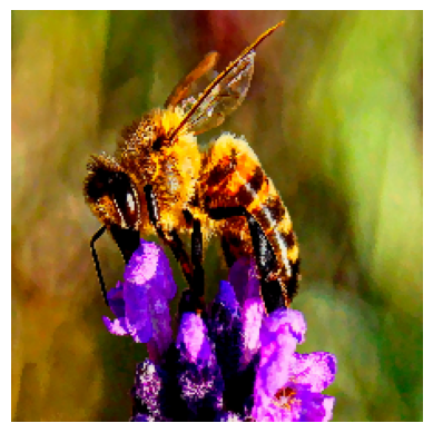
Here we apply the general workflow with image data from  . The data item of interest is an image of a bee and we use the ResNet 50 model trained on Imagenet to classify 1000 types of objects. We are interested in which pixels are contributing positively (red) and which - negatively (blue) towards the model’s decision to classify the image as a ‘bee’ and we would like to use the
RISE explainer:
. The data item of interest is an image of a bee and we use the ResNet 50 model trained on Imagenet to classify 1000 types of objects. We are interested in which pixels are contributing positively (red) and which - negatively (blue) towards the model’s decision to classify the image as a ‘bee’ and we would like to use the
RISE explainer:
*For a full example see the rise_imagenet tutorial
Provide your trained model and image of interest.
Initialize the pretrained model.
[11]:
class Model():
    def __init__(self):
        K.set_learning_phase(0)
        self.model = ResNet50()
        self.input_size = (224, 224)

    def run_on_batch(self, x):
        return self.model.predict(x)

model = Model()
WARNING:tensorflow:From C:\Users\ChristiaanMeijer\anaconda3\envs\dianna3113\Lib\site-packages\keras\src\backend.py:1398: The name tf.executing_eagerly_outside_functions is deprecated. Please use tf.compat.v1.executing_eagerly_outside_functions instead.

WARNING:tensorflow:From C:\Users\ChristiaanMeijer\anaconda3\envs\dianna3113\Lib\site-packages\keras\src\layers\normalization\batch_normalization.py:979: The name tf.nn.fused_batch_norm is deprecated. Please use tf.compat.v1.nn.fused_batch_norm instead.
Load and preprocess the ‘bee’ image.
[12]:
def load_img(path):
    img = keras_utils.load_img(path, target_size=model.input_size)
    x = keras_utils.img_to_array(img)
    preproc_img = preprocess_input(x)
    return img, preproc_img
[13]:
img, preproc_img = load_img(download('bee.jpg', 'data'))
fig, ax = plt.subplots()
ax.axis('off')
plt.imshow(img)
Downloading data from 'https://github.com/dianna-ai/dianna/raw/main/dianna/data/bee.jpg' to file 'C:\Users\ChristiaanMeijer\AppData\Local\dianna\dianna\Cache\bee.jpg'.
[13]:
<matplotlib.image.AxesImage at 0x1fff1f1e650>
Which are the classes your model has been trained for? Which of these classes do you want an explanation for?
[14]:
labels = [range(1000)]  # 1000 classes of objects
# we are interested why our image is classified as a 'bee'
def class_name(idx):
    return decode_predictions(np.eye(1, 1000, idx))[0][0][1]
for i in range(1000):
    if class_name(i) == 'bee':
        explained_class_index = i
print(explained_class_index)
print(class_name(explained_class_index))
309
bee
Run dianna with the explainer of your choice, ‘RISE’, and visualize the output. For image use the
explain_imagefunction.
RISE masks random portions of the input image and passes the masked image through the model — the masked portion that decreases accuracy the most is the most “important” portion.To call the explainer and generate relevance scores map, the user need to specifiy the number of masks being randomly generated (n_masks), the resolution of features in masks (feature_res) and for each mask and each feature in the image, the probability of being kept unmasked (p_keep).
[15]:
explanation = dianna.explain_image(model.run_on_batch, preproc_img, method="RISE", labels=[i for i in range(1000)],
                                   n_masks=1000, feature_res=6, p_keep=.1, axis_labels={2: 'channels'})
Explaining: 0%| | 0/10 [00:00<?, ?it/s]
4/4 [==============================] - 4s 597ms/step
Explaining: 10%|█ | 1/10 [00:03<00:35, 3.95s/it]
4/4 [==============================] - 3s 608ms/step
Explaining: 20%|██ | 2/10 [00:06<00:26, 3.27s/it]
4/4 [==============================] - 3s 579ms/step
Explaining: 30%|███ | 3/10 [00:09<00:20, 2.98s/it]
4/4 [==============================] - 3s 582ms/step
Explaining: 40%|████ | 4/10 [00:12<00:17, 2.84s/it]
4/4 [==============================] - 3s 637ms/step
Explaining: 50%|█████ | 5/10 [00:14<00:14, 2.84s/it]
4/4 [==============================] - 3s 666ms/step
Explaining: 60%|██████ | 6/10 [00:17<00:11, 2.89s/it]
4/4 [==============================] - 3s 647ms/step
Explaining: 70%|███████ | 7/10 [00:20<00:08, 2.93s/it]
4/4 [==============================] - 3s 686ms/step
Explaining: 80%|████████ | 8/10 [00:24<00:06, 3.01s/it]
4/4 [==============================] - 3s 688ms/step
Explaining: 90%|█████████ | 9/10 [00:27<00:03, 3.07s/it]
4/4 [==============================] - 4s 794ms/step
Explaining: 100%|██████████| 10/10 [00:30<00:00, 3.09s/it]
Make predictions and check the top 5 predictions.
[16]:
predictions = model.model.predict(preproc_img[None, ...])
# print the index and name of the top predicted class, taking care of adding a batch axis to the model input
print("Top predicted class index: ", np.argmax(predictions))
print("Top 5 predicted class name: ", class_name(np.argmax(predictions)))

prediction_ids = np.argsort(predictions)[0][-1:-6:-1]
print("Top 5 predicted class indicies:", prediction_ids)
print("Top 5 predicted class names:")
for class_idx in prediction_ids:
    print(class_name(class_idx))
1/1 [==============================] - 0s 485ms/step
Top predicted class index:  309
Top 5 predicted class name:  bee
Top 5 predicted class indicies: [309 946 308 319  74]
Top 5 predicted class names:
bee
cardoon
fly
dragonfly
garden_spider
Our model has predicted the image class correctly. Visualize the relevance scores for the ‘bee’ class.
[17]:
print(f'Explanation for `{class_name(explained_class_index)}` ({predictions[0][explained_class_index]})')
visualization.plot_image(explanation[explained_class_index], keras_utils.img_to_array(img)/255., heatmap_cmap='bwr')
plt.show()
Explanation for `bee` (0.9229556322097778)
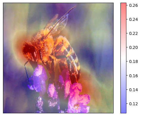
What would make our model think that the image is one of a ‘garden_spider’?
[18]:
another_class_index = 74  # the fifth prediciton was 'garden_spider'
print(f'Explanation for `{class_name(another_class_index)}` ({predictions[0][another_class_index]})')
visualization.plot_image(explanation[another_class_index], keras_utils.img_to_array(img)/255., heatmap_cmap='bwr')
plt.show()
Explanation for `garden_spider` (0.0054000383242964745)
It is interesting to observe that the wings of the insect support the model’s classification of the image as ‘bee’, while the body would be a strong evidence for ‘spider’
Time series example*
*For a full example containing more complicated real temperature data from locations in Europe see the rise_timeseries_weather tutorial
Define your model and time-series of interest.
[19]:
# make up a weather dataset with extrems
cold_with_2_hot_days = np.expand_dims(np.array([30, 29] + list(np.zeros(26))) , axis=1)
data_extreme = cold_with_2_hot_days
fig = plt.figure()
plt.plot(data_extreme)
plt.xlabel("Time index")
plt.ylabel("Celcius")
plt.title("Temperature")
plt.show()
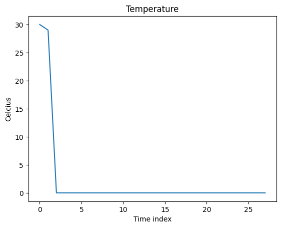
We can define an ‘expert’ model which decides it’s summer if the mean temperature is above a threshold, and winter - otherwise.
[20]:
# We define a threshold for the model to make decisions
# The label is ["summer", "winter"]
threshold = 14

def run_expert_model(data):
    is_summer = np.mean(np.mean(data, axis=1), axis=1) > threshold
    number_of_classes = 2
    number_of_instances = data.shape[0]
    result = np.zeros((number_of_instances ,number_of_classes))
    result[is_summer] = [1.0, 0.0]
    result[~is_summer] = [0.0, 1.0]
    return result
Which are the classes your model has been trained for? Which of these classes do you want an explanation for?
[21]:
labels = ('summer', 'winter')  # two seasons
explained_class_index = labels.index('summer')  # we are interested why our time-series is classified as 'summer'
explained_class_index
labels.index('summer')
[21]:
0
Run dianna with the explainer of your choice, ‘RISE’, and visualize the output. For time-series data use the
explain_timeseriesfunction.
RISE masks random portions of the input time-series based on given segmentations and passes the masked time-series through the model — the masked portion that decreases accuracy the most is the most “important” portion. we need to define the approach for masking (mask_type). Since our data is highly skewed, here we make the masked data cutoff to be the “threshold” value instead of the mean.
[22]:
# we use the threshold to mask the data
def input_train_mean(_data):
    return threshold
[23]:
# call the explainer
explanation = dianna.explain_timeseries(run_expert_model, input_timeseries=data_extreme,
                                        method='rise', labels=[0,1], p_keep=0.1,
                                        n_masks=10000, mask_type=input_train_mean)
Explaining: 100%|██████████| 100/100 [00:00<00:00, 16664.56it/s]
Now we can visualize the relevance scores overlaid on time-series using the visualization functionality in dianna.
[24]:
# Normalize the explanation scores for the purpose of visualization
def normalize(data):
    """Squash all values into [-1,1] range."""
    zero_to_one = (data - np.min(data)) / (np.max(data) - np.min(data))
    return 2*zero_to_one -1

heatmap_channel = normalize(explanation[0])
segments = []
for i in range(len(heatmap_channel) - 1):
    segments.append({
        'index': i,
        'start': i - 0.5,
        'stop': i + 0.5,
        'weight': heatmap_channel[i]})
fig, _ = visualization.plot_timeseries(range(len(heatmap_channel)), data_extreme,
                              segments, x_label="Time index", y_label="Temperature", cmap='bwr')
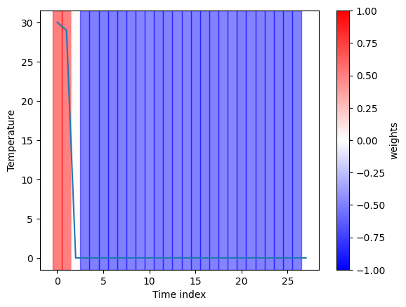
The explanation for the classification of ‘summer’ given by the RISE explainer is consistent with our expectation as it marks all hot days in the timeseries.
Tabular data example*
In the examples so far, we have shown how dianna works on classification problems. Here we demonstrate the KernelSHAP explainer for a regressionproblem of the next-day temperature prediciton on tabular data. The model is an MLP regressor trained on a weather dataset of
temperatures for several locations in Europe.
*The full example is given in the kernalshap_tabular_weather tutorial.
Get the data and the model to explain
Load and prepare the data. As the target, the sunshine hours for the next day in the data-set will be used. Therefore, we will remove the last data point as this has no target. A tabular regression model will be trained which does not require time-based data, therefore DATE and MONTH can be removed.
Select an instance to explain. DIANNA requires input in numpy format, so the input data is converted into a numpy array.
[25]:
data = pd.read_csv(download('weather_prediction_dataset_light.csv', 'data'))

X_data = data.drop(columns=['DATE', 'MONTH'])[:-1]
y_data = data.loc[1:]["BASEL_sunshine"]

# training, validation and test split
X_train, X_holdout, y_train, y_holdout = train_test_split(X_data, y_data, test_size=0.3, random_state=0)
X_val, X_test, y_val, y_test = train_test_split(X_holdout, y_holdout, test_size=0.5, random_state=0)

# select an instance to explain
data_instance = X_test.iloc[10].to_numpy()
Downloading data from 'doi:10.5281/zenodo.5071376/weather_prediction_dataset_light.csv' to file 'C:\Users\ChristiaanMeijer\AppData\Local\dianna\dianna\Cache\weather_prediction_dataset_light.csv'.
[26]:
X_test.describe()
[26]:
| BASEL_cloud_cover | BASEL_humidity | BASEL_pressure | BASEL_global_radiation | BASEL_precipitation | BASEL_sunshine | BASEL_temp_mean | BASEL_temp_min | BASEL_temp_max | DE_BILT_cloud_cover | ... | SONNBLICK_temp_mean | SONNBLICK_temp_min | SONNBLICK_temp_max | TOURS_humidity | TOURS_pressure | TOURS_global_radiation | TOURS_precipitation | TOURS_temp_mean | TOURS_temp_min | TOURS_temp_max | |
|---|---|---|---|---|---|---|---|---|---|---|---|---|---|---|---|---|---|---|---|---|---|
| count | 548.000000 | 548.000000 | 548.000000 | 548.000000 | 548.000000 | 548.000000 | 548.000000 | 548.000000 | 548.000000 | 548.000000 | ... | 548.000000 | 548.000000 | 548.000000 | 548.000000 | 548.000000 | 548.000000 | 548.000000 | 548.000000 | 548.000000 | 548.000000 |
| mean | 5.633212 | 0.745055 | 1.018165 | 1.263376 | 0.267792 | 4.264781 | 10.867883 | 6.972810 | 15.215693 | 5.385036 | ... | -4.708759 | -7.042883 | -2.348723 | 0.784799 | 1.017591 | 1.352026 | 0.165146 | 12.007117 | 7.735219 | 16.278832 |
| std | 2.246783 | 0.104896 | 0.007659 | 0.914286 | 0.580999 | 4.294393 | 6.992134 | 6.362011 | 8.281353 | 2.230648 | ... | 6.874519 | 7.120717 | 6.751890 | 0.116005 | 0.008289 | 0.929626 | 0.372046 | 6.246073 | 5.570369 | 7.420308 |
| min | 0.000000 | 0.420000 | 0.989300 | 0.060000 | 0.000000 | 0.000000 | -6.100000 | -11.200000 | -3.700000 | 0.000000 | ... | -25.600000 | -28.600000 | -24.700000 | 0.370000 | 0.985200 | 0.050000 | 0.000000 | -5.000000 | -9.000000 | -1.600000 |
| 25% | 4.000000 | 0.677500 | 1.013700 | 0.470000 | 0.000000 | 0.300000 | 5.575000 | 2.075000 | 9.200000 | 4.000000 | ... | -9.500000 | -12.200000 | -6.900000 | 0.710000 | 1.013000 | 0.517500 | 0.000000 | 7.375000 | 3.675000 | 10.800000 |
| 50% | 6.000000 | 0.760000 | 1.017900 | 1.000000 | 0.010000 | 2.900000 | 10.950000 | 7.100000 | 15.050000 | 6.000000 | ... | -4.300000 | -6.350000 | -2.250000 | 0.800000 | 1.017650 | 1.220000 | 0.000000 | 11.600000 | 8.200000 | 16.050000 |
| 75% | 7.000000 | 0.820000 | 1.022950 | 1.922500 | 0.252500 | 7.400000 | 16.325000 | 11.825000 | 21.700000 | 7.000000 | ... | 0.300000 | -1.500000 | 2.025000 | 0.872500 | 1.023300 | 2.050000 | 0.160000 | 17.000000 | 12.025000 | 22.300000 |
| max | 8.000000 | 0.970000 | 1.040300 | 3.470000 | 5.360000 | 15.000000 | 27.700000 | 19.600000 | 35.900000 | 8.000000 | ... | 10.400000 | 6.900000 | 14.100000 | 0.990000 | 1.038800 | 3.450000 | 3.240000 | 27.700000 | 20.600000 | 36.200000 |
8 rows × 89 columns
[27]:
print(data_instance)
[  8.       0.76     1.0003   0.92     0.39     0.2      2.      -0.2
   4.7      4.       0.85     1.0038   1.28     0.2      5.5      3.8
  -1.       8.5      8.       0.87     0.73     0.14     0.       1.5
  -1.1      3.8      4.       0.83     1.0024   0.98     0.12     2.9
   3.3     -2.7      8.8      5.       0.68     1.0124   0.96     0.04
   2.5      4.4      1.9      6.9      0.83     0.9996   1.14     0.21
   3.9      2.      -2.       6.8      6.       0.84     1.0034   1.21
   0.02     4.7      3.3     -1.5      8.3      0.16     3.2     -0.4
   7.9      8.       0.86     0.997    0.54     0.58     0.       1.2
  -0.2      2.8      8.       0.98     1.45     0.9      0.     -16.8
 -17.6    -15.9      0.87     1.0079   0.81     0.14     4.       0.2
   7.8   ]
Download the pretrained ONNX model
[28]:
# download onnx model and check the prediction with it
model_path = download('sunshine_hours_regression_model.onnx', 'model')

loaded_model = SimpleModelRunner(model_path)
predictions = loaded_model(data_instance.reshape(1,-1).astype(np.float32))
predictions
Downloading data from 'doi:10.5281/zenodo.10580832/sunshine_hours_regression_model.onnx' to file 'C:\Users\ChristiaanMeijer\AppData\Local\dianna\dianna\Cache\sunshine_hours_regression_model.onnx'.
[28]:
array([[3.0719438]], dtype=float32)
A runner function is created to prepare data for the ONNX inference session.
[29]:
import onnxruntime as ort

def run_model(data):
    # get ONNX predictions
    sess = ort.InferenceSession(model_path)
    input_name = sess.get_inputs()[0].name
    output_name = sess.get_outputs()[0].name

    onnx_input = {input_name: data.astype(np.float32)}
    pred_onnx = sess.run([output_name], onnx_input)[0]

    return pred_onnx
Run dianna with the KernelSHAP explainer and visualize the output:
The simplest way to run DIANNA on tabular data is with dianna.explain_tabular. Note, that the training data is also required since KernelSHAP needs it to generate proper perturbation. The method’s mode needs to be spesified as ‘regression’.
[30]:
explanation = dianna.explain_tabular(run_model, input_tabular=data_instance, method='kernelshap',
                                     mode ='regression', training_data = X_train,
                                     training_data_kmeans = 5, feature_names=X_test.columns)
The output can be visualized with the DIANNA built-in visualization function. It shows the top 10 importance of each feature contributing to the prediction.
[31]:
from dianna.visualization import plot_tabular

fig, _ = plot_tabular(explanation, X_test.columns, num_features=10)
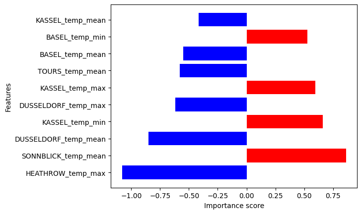
We can see which min or max temperatures of which locations mostly influence (positively or negatively) the predicted by the trained modelnext-day temperature in Basel.
Explainers
DIANNA supports LIME, RISE and KernalSHAP XAI methods. It allows users to compare the outputs of three different explainers on the same model and data, illustrated best by dianna’s dashboard. This section briefly demonstrates how to
run on the command line the supported explainers for the simple binary classification task of distinguishing the hand-written digits “0” and “1” on a test example from the Binary MNIST dataset  , a subset of the MNIST benchmark. It also gives the basics for each of the explainers.
Explaining a Pretrained Binary MNIST Classification Model *
Load the Binary MNIST data, the pretrained binary MNIST model and chose image to be explained.
[32]:
# load dataset
data_path = download('binary-mnist.npz', 'data')
data = np.load(data_path)
# load testing data and the related labels
X_test = data['X_test'].astype(np.float32).reshape([-1, 28, 28, 1]) / 256
y_test = data['y_test']
Downloading data from 'https://github.com/dianna-ai/dianna/raw/main/dianna/data/binary-mnist.npz' to file 'C:\Users\ChristiaanMeijer\AppData\Local\dianna\dianna\Cache\binary-mnist.npz'.
[33]:
# Download the onnx model

# load the onnx model and check the prediction with it
model_path = download('mnist_model_tf.onnx', 'model')
onnx_model = onnx.load(model_path)
# get the output node
output_node = prepare(onnx_model, gen_tensor_dict=True).outputs[0]
Downloading data from 'https://github.com/dianna-ai/dianna/raw/main/dianna/models/mnist_model_tf.onnx' to file 'C:\Users\ChristiaanMeijer\AppData\Local\dianna\dianna\Cache\mnist_model_tf.onnx'.
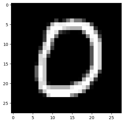
Print class and image of a single instance in the test data for preview.
[34]:
# class name
class_name = ['digit 0', 'digit 1']
# instance index
i_instance = 3
# select instance for testing
test_sample = X_test[i_instance]
# model predictions with added batch axis to test sample
predictions = prepare(onnx_model).run(test_sample[None, ...])[f'{output_node}']
pred_class = class_name[np.argmax(predictions)]
other_class = class_name[np.argmin(predictions)]
# get the index of predictions
top_preds = np.argsort(-predictions)
inds = top_preds[0]
print("The predicted class for this test image is:", pred_class)
plt.imshow(X_test[i_instance][:,:,0], cmap='gray')  # 0 for channel
The predicted class for this test image is: digit 0
[34]:
<matplotlib.image.AxesImage at 0x20018e02c50>
1. LIME
LIME (Local Interpretable Model-agnostic Explanations) is an explainable-AI method that aims to create an interpretable model that locally represents the classifier.
To use dianna with LIME, in the explanation function (for images explain_image) we simply specify method="LIME" and optionally specify the LIME hyperparameters.
[35]:
# need to preprocess, because we divided the input data by 256 for the models and LIME needs RGB values
def preprocess_function(image):
    return (image / 256).astype(np.float32)

# An explanation is returned for each label, but we ask for just one label so the output is a list of length one.
relevances = dianna.explain_image(model_path, test_sample * 256, method="LIME",
                                   axis_labels=('height','width','channels'),
                                   random_state=2,
                                   labels=[i for i in range(2)], preprocess_function=preprocess_function)
[36]:
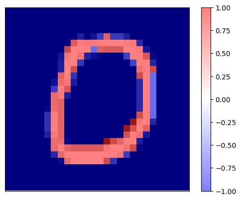
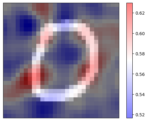
print(f'Explaination for `{pred_class}` with LIME')
fig, _ = visualization.plot_image(relevances[0], X_test[i_instance][:,:,0], data_cmap='gray')
Explaination for `digit 0` with LIME
[37]:
print(f'Explaination for `{other_class}` with LIME')
fig, _ = visualization.plot_image(relevances[1], X_test[i_instance][:,:,0], data_cmap='gray')
Explaination for `digit 1` with LIME
It is worth noting that the explanation maps for both binary classes are complementary.
2. RISE
RISE is short for Randomized Input Sampling for Explanation of Black-box Models. It estimates the relevance empirically by probing the model with randomly masked versions of the input image to obtain the corresponding outputs.
RISE masks random portions of the input image and passes the masked image through the model — the portion that decreases the accuracy the most is the most “important” portion. To call the explainer and generate the relevance scores, the user need to specified the number of masks being randomly generated (n_masks), the resolution of features in masks (feature_res) and for each mask and each feature in the image, the probability of being kept unmasked (p_keep).
To use dianna with RISE, in the explanation function (for images explain_image) we simply specify method="RISE" and optionally specify the RISE hyperparameters.
[38]:
relevances = dianna.explain_image(model_path, test_sample, method="RISE",
                                labels=[i for i in range(2)],
                                n_masks=5000, feature_res=8, p_keep=.1,
                                axis_labels=('height','width','channels'))[0]
Explaining: 100%|██████████| 50/50 [00:01<00:00, 41.09it/s]
Visualize the relevance scores for the predicted class on top of the image.
[39]:
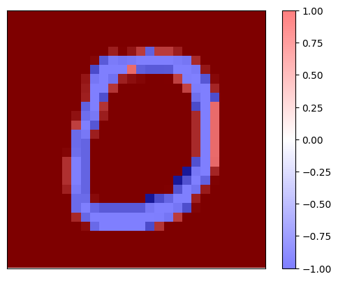
print(f'Explaination for `{pred_class}` with RISE')
fig, _ = visualization.plot_image(relevances, X_test[i_instance][:,:,0], data_cmap='gray')
Explaination for `digit 0` with RISE
It is worth noting that the explanation map clearly shows the pixels which contribute positively (in red) to the “0” classification on the shape of the hand-written digit and the pixels whcih contributed negatively (in blue) for that decision resemble the complimentary class for “1” digits.
3. KernelSHAP
SHapley Additive exPlanations, in short, SHAP, is a model-agnostic explainable AI approach which is used to decrypt the black-box models through estimating the Shapley values, which represent the relevancies of each data feature (image pixel, word in text, etc.). KernelSHAP is a variant of SHAP. It is a method that uses the LIME framework to compute Shapley Values, and visualizes the relevance attributions for each pixel/super-pixel by displaying them on an image.
The user needs to specify the number model re-evaluations when explaining each prediction (nsamples). A binary mask need to be applied to the image indicating whihc image regiona are hidden. It requires the background color for the masked image, which can be specified by background.
Performing KernelSHAP for each pixel is inefficient. It is always a good practice to segment the input image to super-pixels and perform computations on them. The user has to specify some keyword arguments related to the segmentation: the (approximate) number of labels in the segmented output image (n_segments), and width of Gaussian smoothing kernel for pre-processing for each image dimension (sigma).
To use dianna with KernelSHAP, in the explanation fucntion ((for images explain_image) we simply specify method=”KernelSHAP” and optionally specify the method’s hyperparameters.
[40]:
# use KernelSHAP to explain the network's predictions
relevances = dianna.explain_image(model_path, test_sample,
                                  method="KernelSHAP", labels=[0], nsamples=1000,
                                  background=0, n_segments=200, sigma=0,
                                  axis_labels=('height','width','channels'))
*For full examples of manycombinationsof explainers and data modalities for both simple benchmarking datasets or for more serious scientific use cases, please, refer todianna’s tutorials.